Saturday, April 29, 2017

Final Blog Post- Renoir

I did my final project based on Renoir's work. Renoir was an impressionist painter in the late 19th century. He mainly focused on portraits and nature. When deciding what to do my final art project on I look up 'famous Renoir nature paintings.' This resulted in a multitude of different art pieces from Renoir of which one stuck out to me the most. This painting was named The Gust of Wind.


This painting seemed very familiar to me. I then realized it reminded me of the classic windows background. They look nearly identical!


The two pictures were so alike I decided it would be interesting to compare the two. I printed each of them out and cut them into four strips each. I laid them across the center of the paper with them eventually staggering off. This leads your eye from the left side of the picture to the right side. I then added some green pictures I cut out from magazines at the bottom left corner and added some sky pictures to the top left of the picture, creating a type of heaviness on the left side of the picture and eventually becoming softer the most your eye glides to the right side of the picture. After seeing my finished product I decided it needed something to unify it a little more, so, I decided to add clouds that go over both strips of pictures. The clouds use implied lines like Renoir and created a uniformity between the two similar but different pictures. I believe that although Renoir would classify this picture as very different from his usual work, he can still see some similarities between what I did and what he is used to doing. I believe this is a modern take on his very impressionist work in that I used very sharp lines and implied lines within my piece.

I really enjoyed being in SA224. I learned a lot about how to describe an artists work and to not only look at the literal meaning but also a deeper meaning. Each piece of art is different and can hold their own message. One thing I will defiantly be using in the future is the skills I learned when we did Photoshop. I enjoy manipulating art and changing it through Photoshop. My only advice to make this class better is to have more time in class to work on projects. Overall, I really enjoyed learning more about art and how to interpret it.

Monday, April 17, 2017

Light City


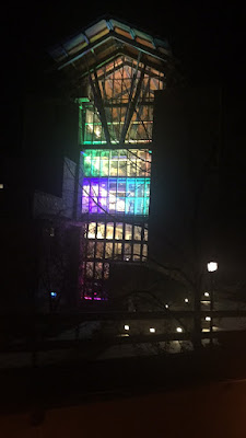
On Tuesday, April 4th Loyola's art students put on a Light City, similar to the one in the Inner Harbor.  I walked around campus and admired the cool lights set up on buildings like Sellinger and the library.


McManus theater also had a cool station where someone could write something with a light and if a photo was taken at the right time, you can see what was written. It was pretty cool! McManus theater also had a cool display on the stage with different lights and pictures.


Outside of the Humanities building, there was a huge lit-up Loyola L. The lights frequently changed. Similarly, in the hallway, there was a small Loyola sign that also had changing colored letters. It was interesting to see the two different types of mediums with the similar colorings. I also heard that it was once possible to play Pac-Man on the Loyola sign in the hallway. Overall, I thought it was very cool to see the Light City tradition brought to the Loyola campus!


Visual Analysis of Postmodern Mixed Media

My quote which inspired my piece was "Americans may have no identity, but they do have wonderful teeth." With this quote, I knew I wanted to play on straight and crooked teeth. I placed teeth on a set of four monkeys. Similarly, I placed teeth with different eyes, to create a weird feeling. With the different eyes fit with teeth that did not belong to them, it gave a creepy feel. I also placed the chattering teeth going from biggest to smallest on the bottom right corner. My photos from photoshop are arranged in a spiral. The color scheme of my photos is mostly red, so I went with a water-like blue background to separate the colors.

To me, this quote was very sarcastic and funny. I wanted to play up on the irony. I had the same four monkeys placed together with different types of teeth to show that most Americans try to look all the same, but their teeth give their class away. By placing each photo in such a random array, it helped to convey the image of how silly the idea of having no personality but nice teeth is. The chattering teeth on the bottom right symbolizes Americans who all want to look the same. My overall idea of this piece was to convey similarities and different that exist within Americans while most still try to be the same.